
HarmonyOS开发实战:小分享-TemplateSelectPage模板选择——分类Tab+Grid网格
·

前言
欢迎加入开源鸿蒙跨平台社区:https://openharmonycrossplatform.csdn.net
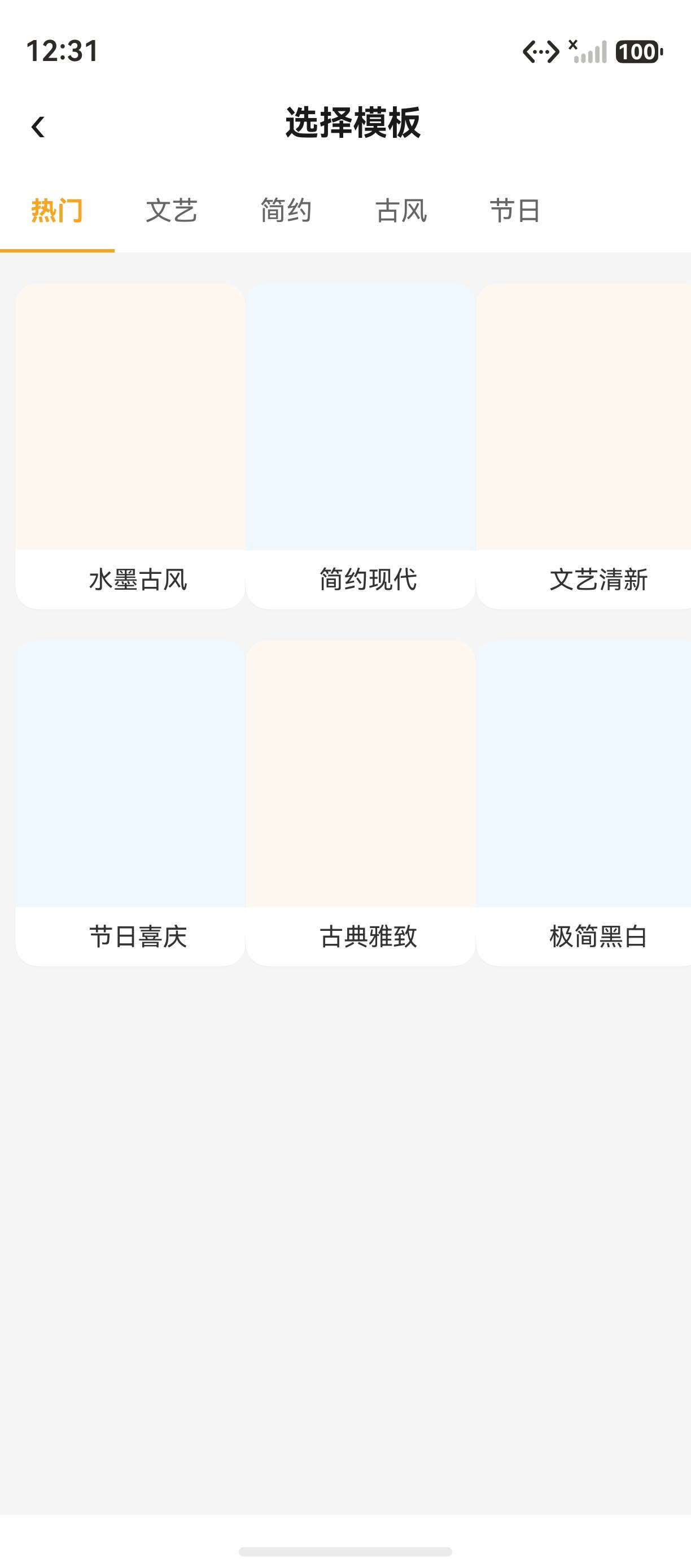
模板选择页 让用户从丰富的模板库中选择喜欢的样式,支持分类筛选和网格预览。小分享 App 的 TemplateSelectPage 使用 Grid 组件 实现三列网格布局,通过 Tab 分类切换 筛选模板。本篇讲解 Grid 网格布局、Tab 下划线、@State 选中态等核心实现。详细 API 可参考 HarmonyOS Grid 官方文档。
一、TemplateSelectPage 完整代码
1.1 页面完整实现
import router from '@ohos.router';
import { TemplateItem } from '../common/interfaces';

@Entry
@Component
struct TemplateSelectPage {
  @State selectedCategory: number = 0;
  private categories: string[] = ['热门', '文艺', '简约', '古风', '节日'];
  private templates: Array<TemplateItem> = [
    { title: '水墨古风', style: '古风' },
    { title: '简约现代', style: '简约' },
    { title: '文艺清新', style: '文艺' },
    { title: '节日喜庆', style: '节日' },
    { title: '古典雅致', style: '古风' },
    { title: '极简黑白', style: '简约' }
  ];

  build() {
    Column() {
      this.HeaderBar()
      this.CategoryTabs()
      this.TemplateGrid()
    }
    .width('100%').height('100%').backgroundColor('#F5F5F5')
  }
}
1.2 Header 导航栏
Row() {
  Text('‹').fontSize(24).fontColor('#1A1A1A').onClick(() => { router.back() })
  Text('选择模板').fontSize(18).fontWeight(FontWeight.Bold).fontColor('#1A1A1A').layoutWeight(1).textAlign(TextAlign.Center)
  Text('').fontSize(20).fontColor('#999999').onClick(() => { router.back() })
}
.width('100%').padding({ left: 16, right: 16, top: 12, bottom: 12 }).backgroundColor(Color.White)
二、分类 Tab 实现
2.1 Tab 数据
private categories: string[] = ['热门', '文艺', '简约', '古风', '节日'];
2.2 Tab 选中下划线
.border({
  width: { bottom: 2 },
  color: { bottom: this.selectedCategory === index ? '#F5A623' : Color.Transparent }
})
2.3 Tab 选中态对比
| 状态 | 文字颜色 | 下划线颜色 | 字重 |
|---|---|---|---|
| 选中 | #F5A623 |
#F5A623 |
Bold |
| 未选中 | #666666 |
透明 | Normal |
三、Grid 网格布局
3.1 基本结构
Grid() {
  ForEach(this.templates, (item: TemplateItem, index: number) => {
    GridItem() {
      this.TemplateCard(item, index)
    }
  }, (item: TemplateItem, index: number) => `${item.title}_${index}`)
}
.columnsTemplate('1fr 1fr 1fr')
.rowsGap(0)
.layoutWeight(1)
.padding({ top: 8 })
3.2 columnsTemplate 语法
| 模板 | 说明 | 示例 |
|---|---|---|
'1fr 1fr 1fr' |
三列等分 | 通用 |
'1fr 2fr 1fr' |
中列宽,两侧窄 | 特殊布局 |
'repeat(3, 1fr)' |
三列等分 | 通用 |
'100px 1fr 1fr' |
第一列固定,其余等分 | 侧边栏 |
四、模板卡片设计
4.1 卡片结构
Column() {
  Column() { Text('').fontSize(40) }
    .width('100%').height(140)
    .backgroundColor(index % 2 === 0 ? '#FFF8F0' : '#F0F8FF')
    .borderRadius({ topLeft: 12, topRight: 12 })
  Text(item.title).fontSize(13).fontColor('#333333')
    .width('100%').padding({ left: 8, top: 8, bottom: 8 }).textAlign(TextAlign.Center)
}
.width('100%').backgroundColor(Color.White).borderRadius(12)
.shadow({ radius: 2, color: '#08000000', offsetY: 1 }).margin(8)
4.2 卡片样式参数
| 元素 | 属性 | 值 | 说明 |
|---|---|---|---|
| 预览区 | 高度 | 140px | 模板预览缩略图 |
| 预览区 | 背景色 | #FFF8F0 / #F0F8FF |
交替色 |
| 预览区 | 圆角 | topLeft/topRight 12 | 仅顶部圆角 |
| 标题 | 字号 | 13px | 模板名称 |
| 标题 | 颜色 | #333333 |
深灰色 |
| 卡片 | 阴影 | radius 2, offsetY 1 | 轻阴影 |
五、@State 状态管理
5.1 选中分类
@State selectedCategory: number = 0;
.onClick(() => { this.selectedCategory = index })
六、页面布局结构
Column (主容器,背景 #F5F5F5)
├─ Row (Header 导航栏,白色背景)
│   ├─ Text('‹') 返回
│   ├─ Text('选择模板') 标题
│   └─ Text('') 关闭
├─ Row (分类 Tab 栏,白色背景)
│   ├─ Text('热门') - 选中时 #F5A623, 下划线
│   ├─ Text('文艺')
│   ├─ Text('简约')
│   ├─ Text('古风')
│   └─ Text('节日')
└─ Grid (模板网格) - columnsTemplate('1fr 1fr 1fr')
    ├─ GridItem (模板卡片 1) - 交替背景色
    │   ├─ Column (预览图) 140px 高度
    │   └─ Text(标题) 13px
    ├─ GridItem (模板卡片 2)
    └─ GridItem (模板卡片 3) - 每行 3 个
七、模板数据模型
7.1 TemplateItem 接口
export interface TemplateItem {
  title: string;   // 模板名称
  style: string;   // 风格分类
}
八、完整代码文件索引
| 文件路径 | 说明 |
|---|---|
pages/TemplateSelectPage.ets |
模板选择页面 |
common/interfaces.ets |
TemplateItem 接口定义 |
九、本文涉及的所有 API
| API/组件 | 用途 | 文档链接 |
|---|---|---|
Grid |
网格布局 | Grid |
GridItem |
网格项 | GridItem |
@State |
状态管理 | State Guide |
border() |
边框样式 | Border |
shadow() |
阴影 | Shadow |
borderRadius() |
圆角 | BorderRadius |
router.pushUrl() |
路由跳转 | Router |
ForEach |
循环渲染 | ForEach |
十、实现要点总结
10.1 技术要点
模板选择页的核心实现要点:
- 分类 Tab:使用
border条件渲染实现选中下划线 - Grid 网格:
columnsTemplate('1fr 1fr 1fr')三列等分 - 模板卡片:交替背景色、局部圆角、轻阴影
- @State 管理:
selectedCategory控制分类选中态 - 路由跳转:点击卡片跳转到
TemplateDetailPage
10.2 实战建议
- 分类 Tab 使用
border的bottom方向实现下划线 - Grid 的
columnsTemplate使用1fr等分列宽 - 模板卡片使用
margin(8)保持间距 - 局部圆角使用
borderRadius({topLeft, topRight})
总结
本文详细讲解了 TemplateSelectPage 模板选择页的完整实现。核心知识点包括:分类 Tab 切换(border 下划线实现选中态)、Grid 网格布局(columnsTemplate('1fr 1fr 1fr') 三列等分)、模板卡片设计(交替背景色、局部圆角、轻阴影效果)、@State 状态管理(selectedCategory 控制分类选中态)。这些技术构成了完整的模板选择页面。下一篇我们将深入 TemplateDetailPage 模板详情页的实现。
- TemplateDetailPage 模板详情页
相关资源
- HarmonyOS Grid 官方文档:Grid Reference
- HarmonyOS GridItem 组件:GridItem Reference
- HarmonyOS border 属性:Border Attribute
- HarmonyOS @State 装饰器:@State Guide
- HarmonyOS Router 路由:Router API
- HarmonyOS ForEach 渲染:ForEach Reference
- HarmonyOS 阴影属性:Shadow Attribute
- 开源鸿蒙跨平台社区:https://openharmonycrossplatform.csdn.net
-
SharePreviewPage 分享预览页
-
TemplateDetailPage 模板详情页
如果这篇文章对你有帮助,欢迎点赞👍、收藏⭐、关注🔔,你的支持是我持续创作的动力!

更多推荐
 4
4 0
0- 0


 已为社区贡献2条内容

所有评论(0)